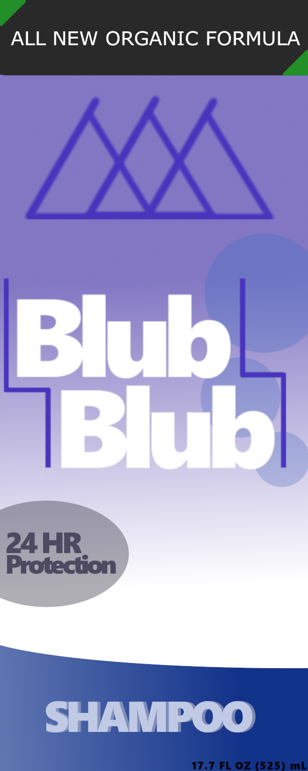
     1. I had an empty bottle of shampoo lying around my house and needed an object to use for this project, figured why not.
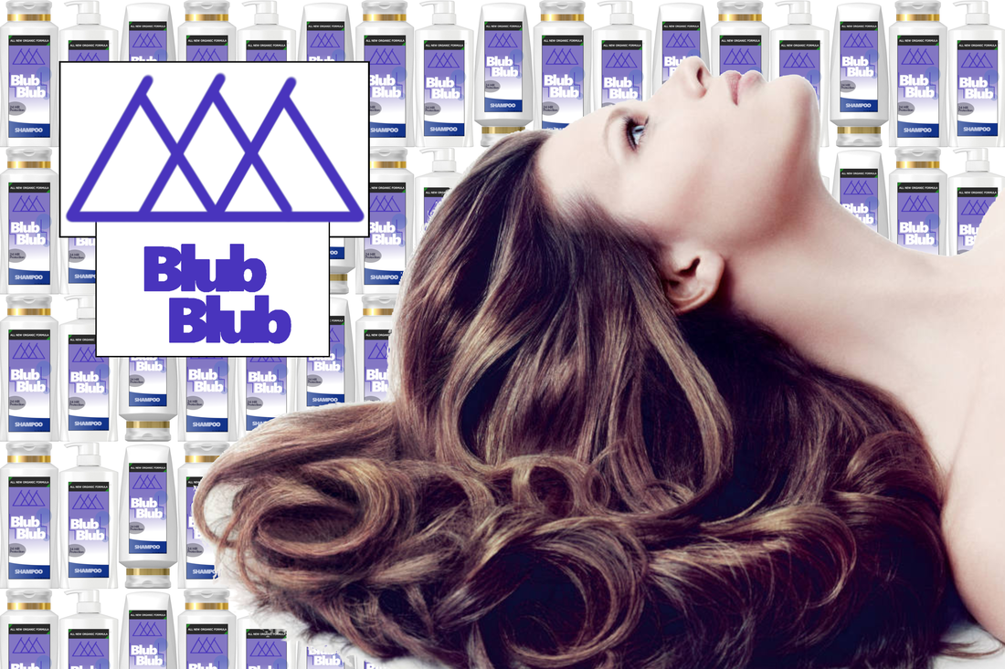
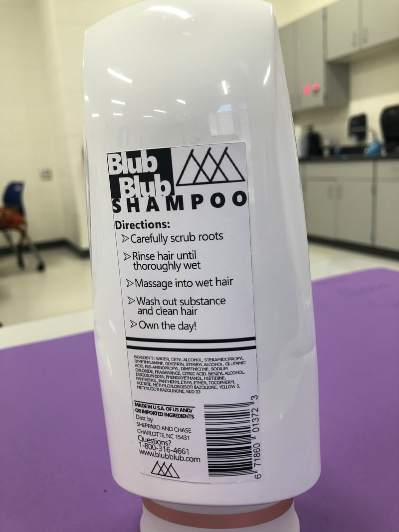
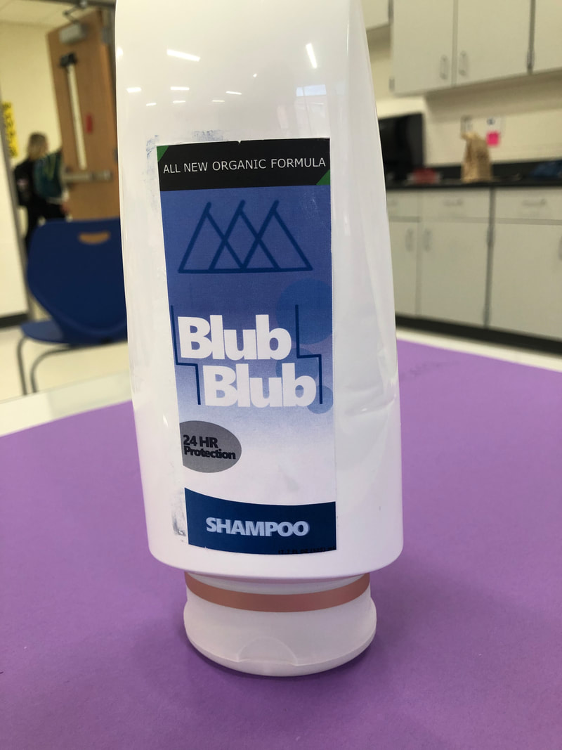
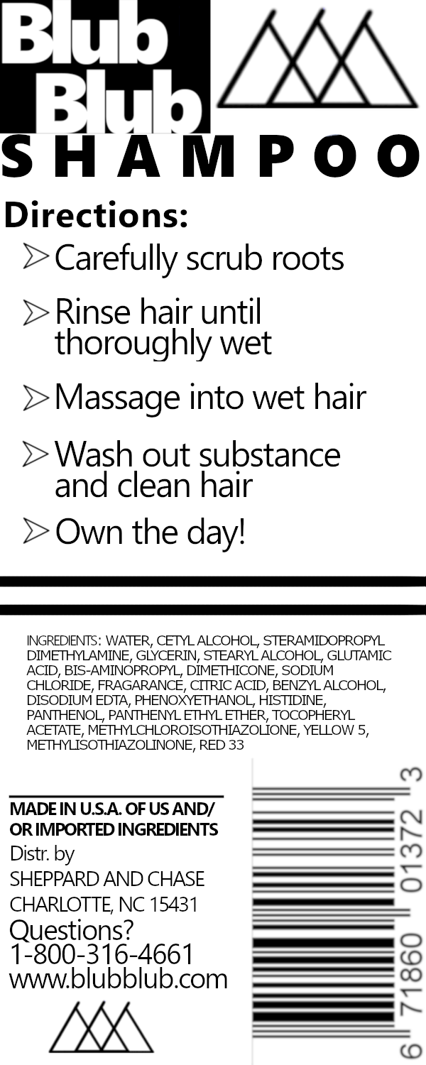
2. First I took the measurement for each sticker to make the sticker, and made the layers. Then I made the company name and logo just by messing around with positioning and lines. After that, I made the extra designs and information with the organic formula and 24hr protection. The back was made primarily going top down copying the original layout of the back of most bottles. 3. The front of the bottle containing the logo looks the best because the colors are very consistent and looks very clean, especially when applied to the real bottle. 4. The "Blub Blub" name is mostly lower quality compared to the rest of the piece and I feel it could be better, especially in the advertisement. The letters are too blended together and need more spacing. 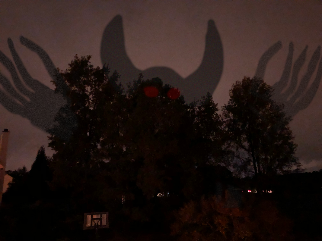 1. This photo was taken looking outside from my bedroom window. It was around 9 o'clock the previous Thursday and I thought it was pretty dark and spooky
2. I though it would be really spooky to have a huge creature emerge out of nowwhere into the dark clouds 3.Originally I had a different of picture the skyline over the field (DJ's Berry Patch) which had just one of the hands creeping down from the cloud. The hand was drawn with a light sketch then eventually filled in. I then applied the noise filter to make it less like a distinct figure. Finally I toned down the opacity and blended it somewhat with various tools. This singular hand didn't look right so I copied it and put it on a new background then modified it to look more naturally coming from the trees with the transform tool. For the last part I drew the shape of the head and horns loosely then matched it with tree line by removing parts with a mask. 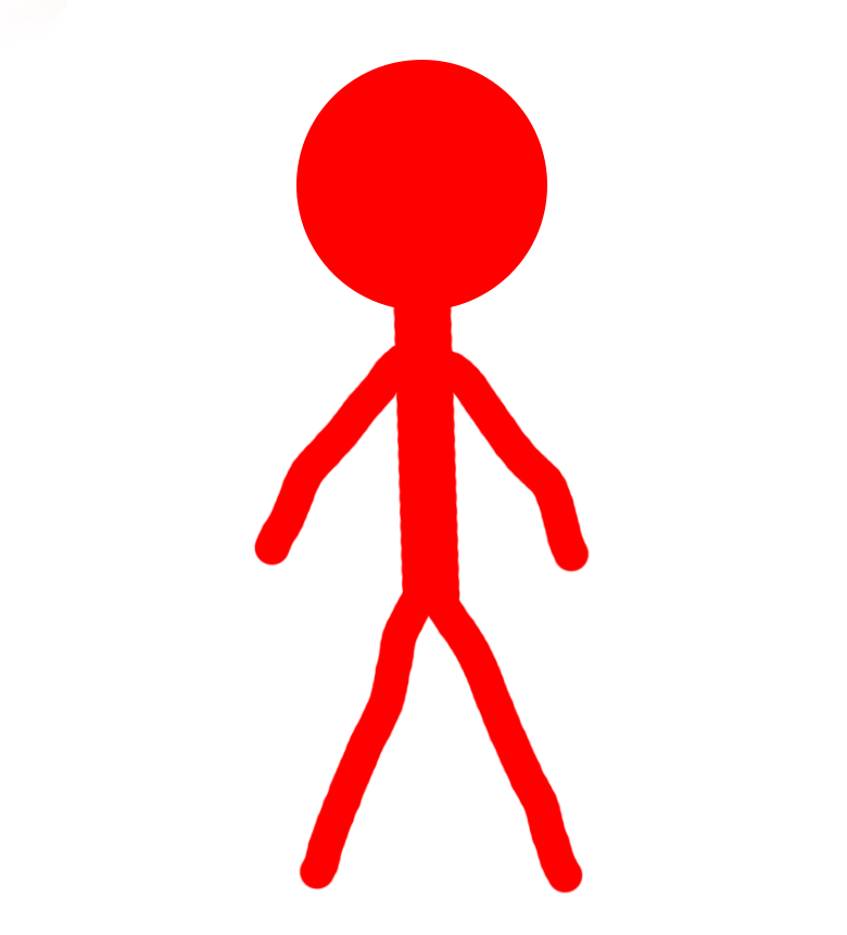 Pros: The shading works well alongside the changing shape of the head from a circle into a oval. You can distinguish the clockwise rotation fairly obviously and each frame works well with the next give it smooth transitioning and looping.
Cons: Basic shapes and colors so there isn't much depth to it. The lines in the arms and legs are also squiggly and clearly hand drawn. The shading also is a little off compared to the original path drawn with the bright red line Process: Originally I had made sketches of stick figures but then decide to make them digital. I imported them into photoshop and traced over them with the brush tool. It was also at this point that I added shading to give it more of a rotation in physical space. Finally I put each of the layers into a frame for the photoshop timeline and exported it as a gif. 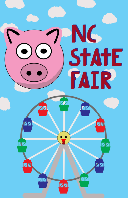 Pros: The Ferris wheel has good colors, looks distinguishable as a Ferris wheel and the carts look nice with clean lines. The general color scheme of the poster is bright and looks happy like the fair. I drew the letters myself and it looks really good, especially the letter "A." Other than the the "C" & "S" the blue backdrop and clean, straight makes it look professional. The pig was made from the eclipse tool for good circles and it turned out well. The clouds also add detail to a rather bland background.
Cons: The shading on the pigs neck isn't smooth at all along with the pig ear outlines. I feel the chicken face in the center of the Ferris wheel could be better and looks out of place with the simple designed Ferris wheel. As mentioned before the "C" and "S" looked scribbled. Process: First I traced a Ferris wheel outline from online then traced another individual cart piece and copied with different to place around the circle. The pig was just made by simple circles and circle outlines. The cloud were the easiest part made by just making rounded figure and coloring it in. 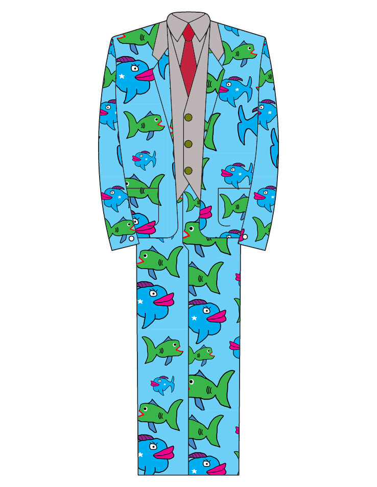 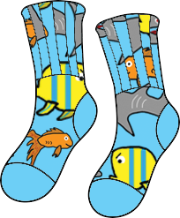 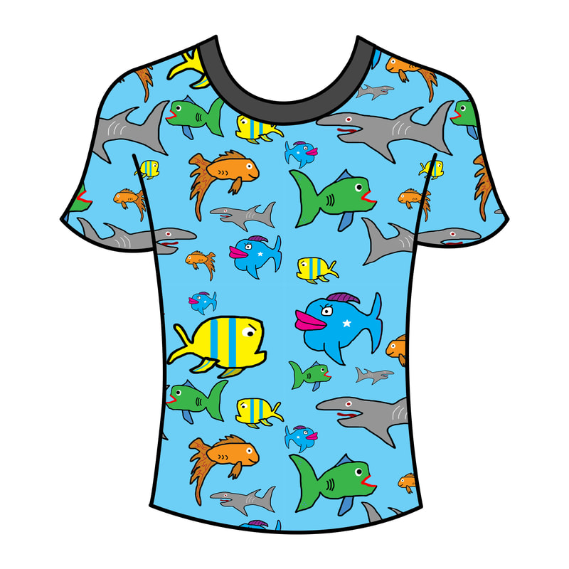 1. For my theme I chose for 3 main reasons:
3. The biggest difficulty was getting them to appear in random pattern. For each one I had to change the size and orientation of each fish so none of them were identical but also they all fit on the original pattern design block. 4. Determining the size of each pattern, logo, and items would be really helpful. I didn't set a specific size for each so the pattern was inconsistent with each new document I made. Also try to do a more structured pattern than random sizes of each logo (fish), for example, brick or striped.  Cons- Tried to make the man crawl out of the ground, doesn't really look that and its hard to see the ballon and him float away in this video. I also wish I had more frames of the rocket.
Pros- Everything is relatively well positioned in relation to the previous frame and I think the the explosion is clear and well represented. Process- For the rocket I made a hard indent on the point of rocket every frame so I knew where to position it for the next frame because of the indenture. The explosion was pretty as I just made the size grow then shrink, it was also a little simpler cause there is no set outline and distinct shape of any explosion so I could kinda make it go anywhere. |
AuthorWrite something about yourself. No need to be fancy, just an overview. Archives
January 2020
Categories |
 RSS Feed
