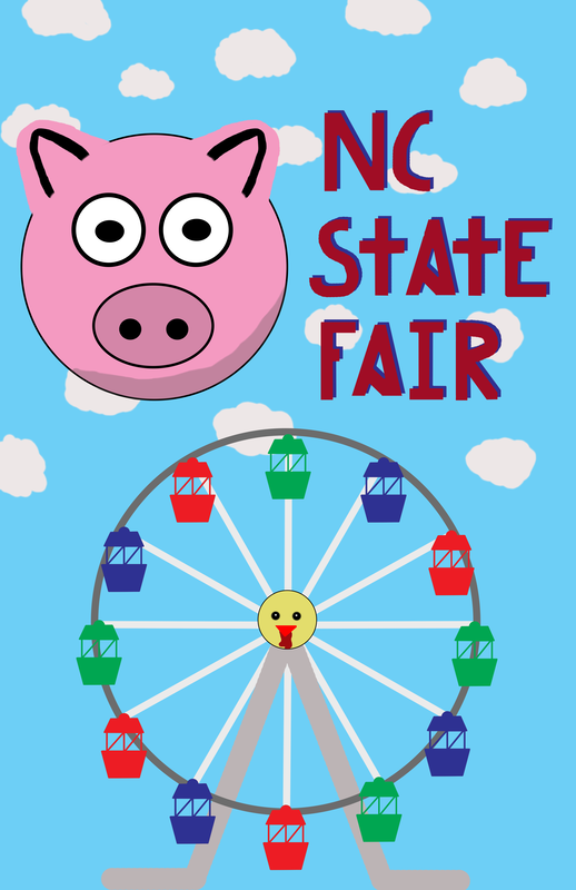
 Pros: The Ferris wheel has good colors, looks distinguishable as a Ferris wheel and the carts look nice with clean lines. The general color scheme of the poster is bright and looks happy like the fair. I drew the letters myself and it looks really good, especially the letter "A." Other than the the "C" & "S" the blue backdrop and clean, straight makes it look professional. The pig was made from the eclipse tool for good circles and it turned out well. The clouds also add detail to a rather bland background.
Cons: The shading on the pigs neck isn't smooth at all along with the pig ear outlines. I feel the chicken face in the center of the Ferris wheel could be better and looks out of place with the simple designed Ferris wheel. As mentioned before the "C" and "S" looked scribbled. Process: First I traced a Ferris wheel outline from online then traced another individual cart piece and copied with different to place around the circle. The pig was just made by simple circles and circle outlines. The cloud were the easiest part made by just making rounded figure and coloring it in.
0 Comments
Leave a Reply. |
AuthorWrite something about yourself. No need to be fancy, just an overview. Archives
January 2020
Categories |
 RSS Feed
