     1. I had an empty bottle of shampoo lying around my house and needed an object to use for this project, figured why not.
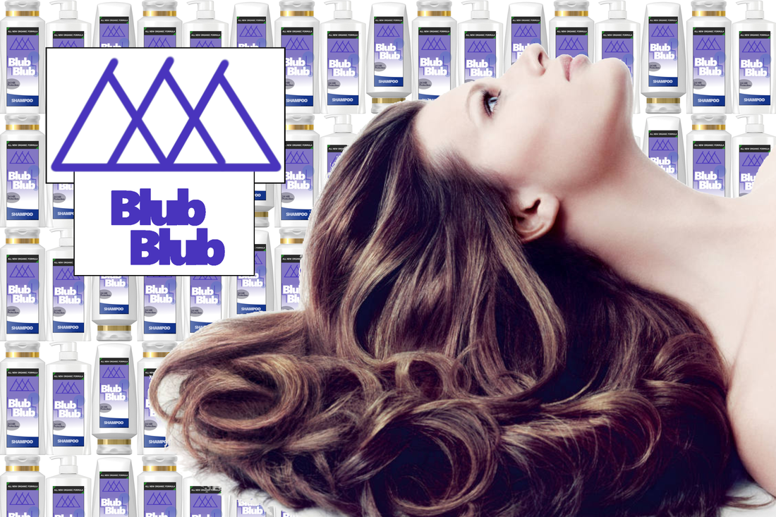
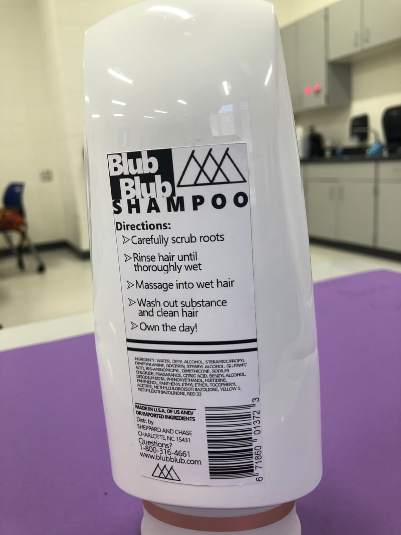
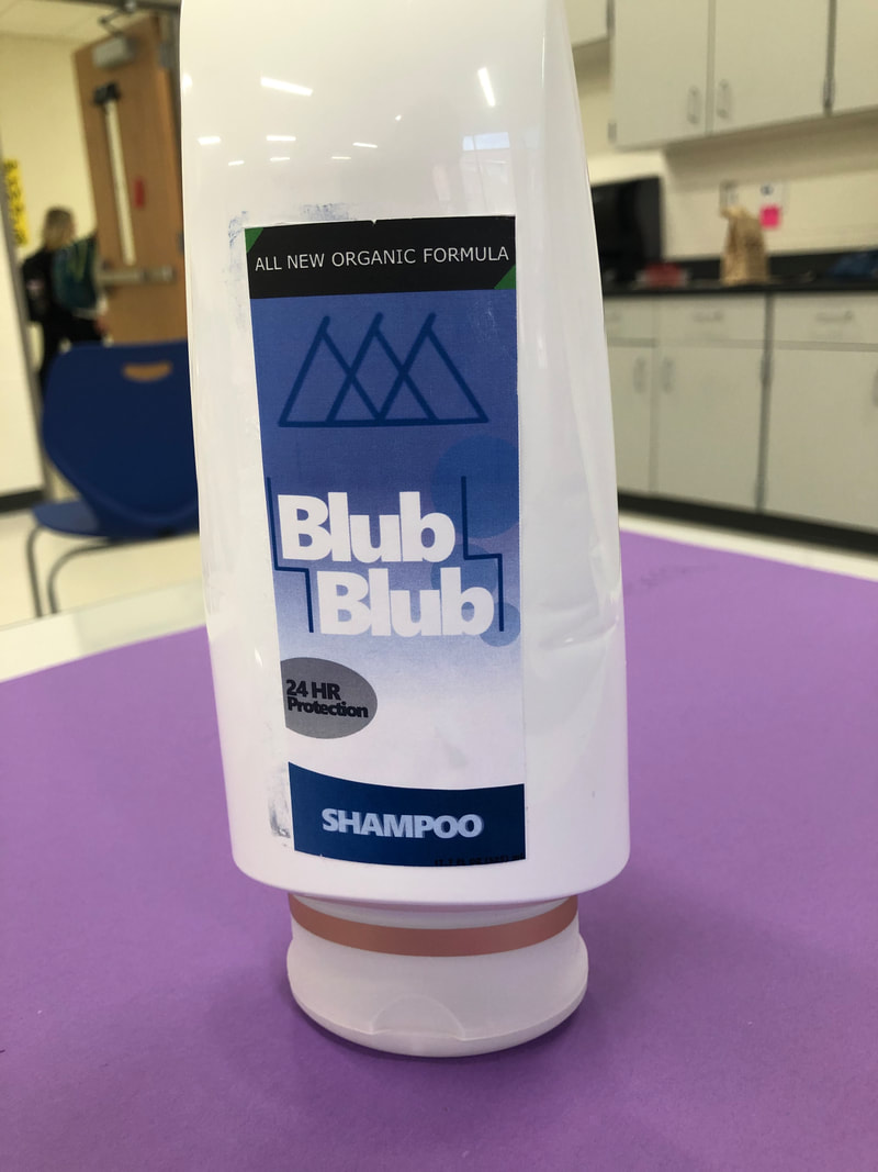
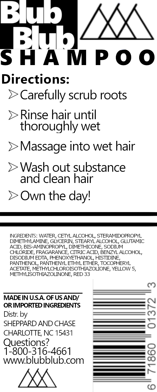
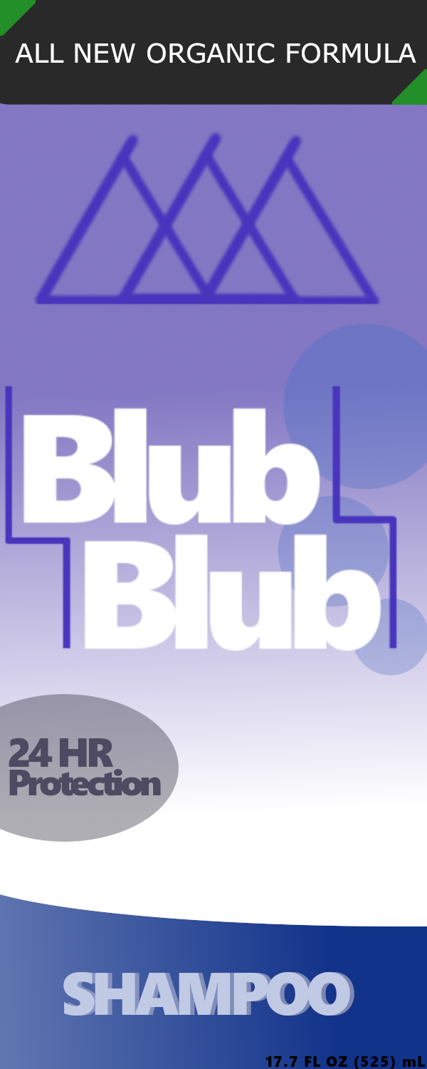
2. First I took the measurement for each sticker to make the sticker, and made the layers. Then I made the company name and logo just by messing around with positioning and lines. After that, I made the extra designs and information with the organic formula and 24hr protection. The back was made primarily going top down copying the original layout of the back of most bottles. 3. The front of the bottle containing the logo looks the best because the colors are very consistent and looks very clean, especially when applied to the real bottle. 4. The "Blub Blub" name is mostly lower quality compared to the rest of the piece and I feel it could be better, especially in the advertisement. The letters are too blended together and need more spacing.
0 Comments
Leave a Reply. |
AuthorWrite something about yourself. No need to be fancy, just an overview. Archives
January 2020
Categories |
 RSS Feed
