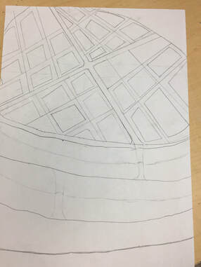
    1. Two Point Perspective
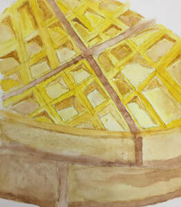
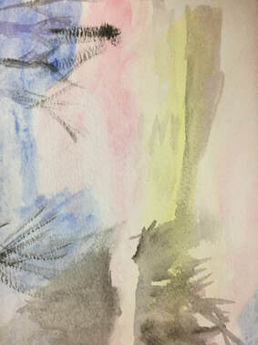
2. Just a picture of waffle because I love waffles and they are a really inspirational piece of my life :) 3. I had trouble creating a consistent color scheme throughout the waffle as some are completely different shades of brown and yellow. 4. The pond painting from the video was helpful in setting up the color and how to start the piece but the sphere painting helped me learn how to incorporate water to make an area brighter without using white.
0 Comments
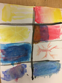    1. Just learning how to mix colors and how they interact with each other. Learning how the water and paint interact with paper is also very helpful
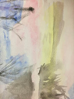
2. I like how you can just easily colors mix colors on your paper with water. 3. I make lots of mistake and I can't really change or do anything about them. I also accidentally mix a lot of colors on accident when using water  1. I tried to draw a waterfall and the surrounding forests and shrubs but I really messed up on the perspective and the angle of the waterfall. This place is important to me because I visit my grandpa a lot in Virginia, while there we always go hiking on this trail that ends at this waterfall. It really reminds of my family.
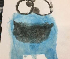
2. I had a hard time making grass textures and of branches in the trees. I could never get a nice blend of colors in the ground and would only end up accidentally mixing the colors, which is why it looked one dark greenish/brown color 3. I think did really well with the water colors with the blues, light blues and white. The splashing of the waterfall also looked good and you could tell it was water crashing. 4. I really just messed around with lots of white and blue to form the water, it was first time ever painting. Other than that I just formed the background then the splits between the 3 different "scenes."
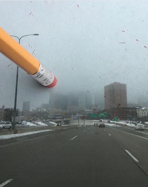
Note: I had the picture of the pencil but my phone completely shattered and lost it. I could only take a picture of the two I brought home
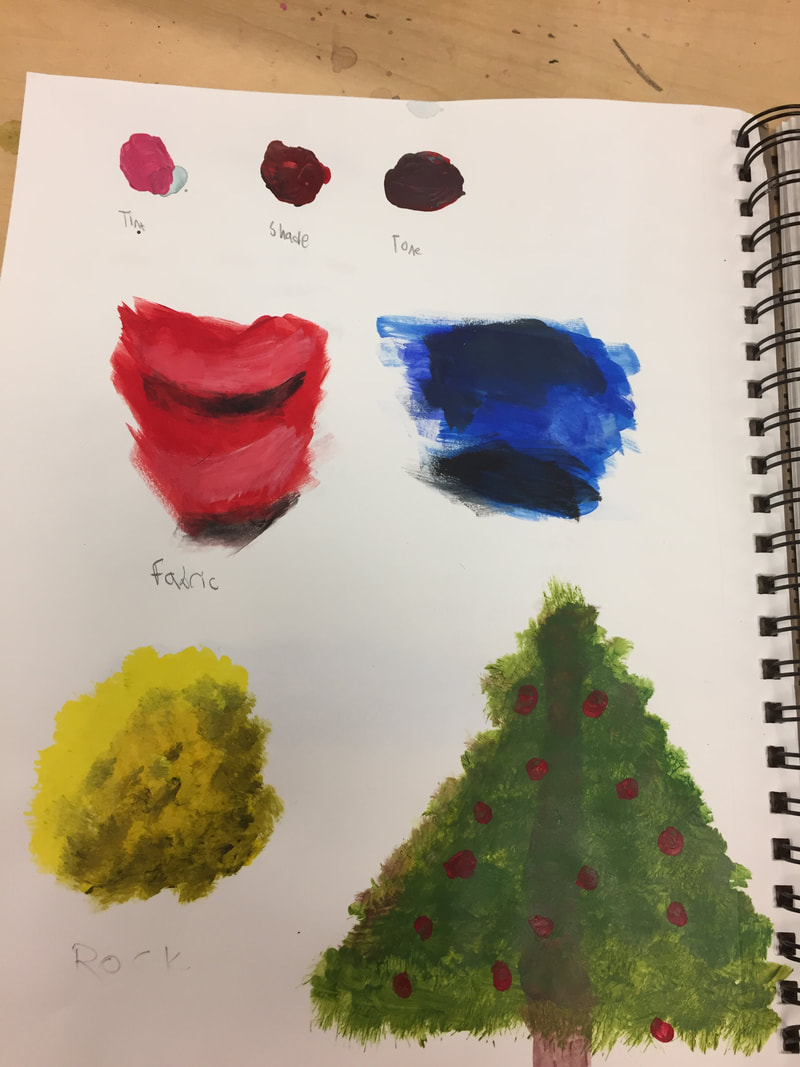
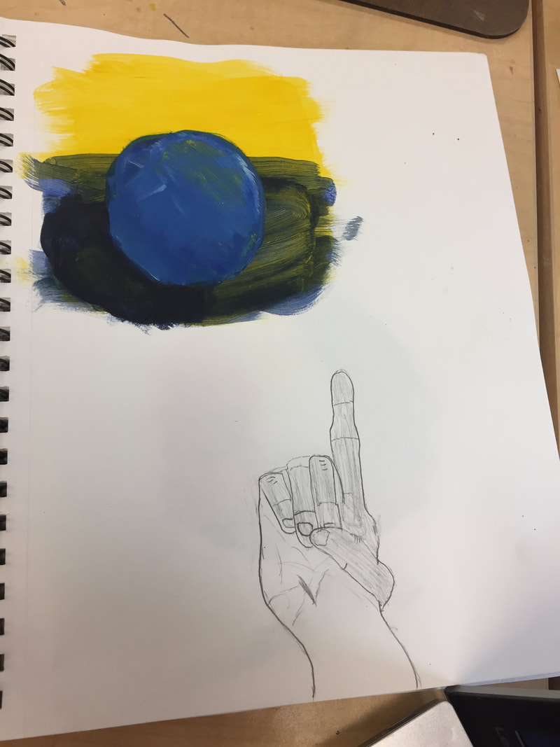
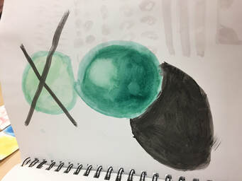
Helpful Warm up: The sphere warm-up was by far the most helpful. It showed the basic principles of shadows and how value is used to show color when there is no color. It showed where it should be the darkest and the lightest. I also learned about how lights reflects slightly when placed on a surface, as well as the relationship to the ground shadow and the light part. Composition and Value: Composition- The arrangement of elements in relation to each other and the edge of your medium/paper Value- The dark and lights in a piece of used to show the change in color in something as well as shadows Pros and Cons of each medium: Pen pros: -Defined lines -Cool and interesting ways of adding value -Looks more professional and Clean Pen Cons: -Cannot erase mistakes -Cannot color in -Must map-out drawing first and pen Pencil Pros: -Easy to use -Erasable mistakes -Shading is easy -Can use smudge tool to easily blend together items Pencil Cons: -I'm a lefty so I always smudge it everywhere -Can't go very dark or defined Charcoal Pros: -Super easy to wipe away mess ups and draw it again -Can easily add value and change from really dark to white -Lots of tools and lots of option Charcoal Cons: -I've never done it before so had to learn how to do it -Requires setup and specific medium -Sucks for lefty -Cannot to really small fine details -Not as pleasing to draw with it than pencil or pen (unpleasant for ears)
|